D I S C O V E R Y / U X R E S E A R C H
J. P. Morgan Content Platform Heuristic Analysis
We conducted a thorough review and evaluation of J.P. Morgan's current content platform and digital ecosystem to identify opportunities to improve:
User flows and information architecture
Curated original content presentation
Visual style and UI patterns
Traffic metrics and user data

D I S C O V E R Y / U X R E S E A R C H
Analysis of Best Practices for Large-Cap, Multi-National Websites
We researched the latest best practices in user experience and information architecture for large-cap, multi-national websites, specifically focusing on:
Homepage structure
Ecosystem architecture
Content presentation
Brand-balance
Curated user flow
D I S C O V E R Y / U X R E S E A R C H
Stakeholder Interviews
We interviewed internal stakeholders and subject matter experts, using a combination of brief talks, surveys, and Q&A sessions to gather their feedback on the following areas:
Improving user flows and content engagement
Reorganizing site structure
Ruthlessly edited the content
Capturing constraints and business requirements
D I S C O V E R Y / U X R E S E A R C H
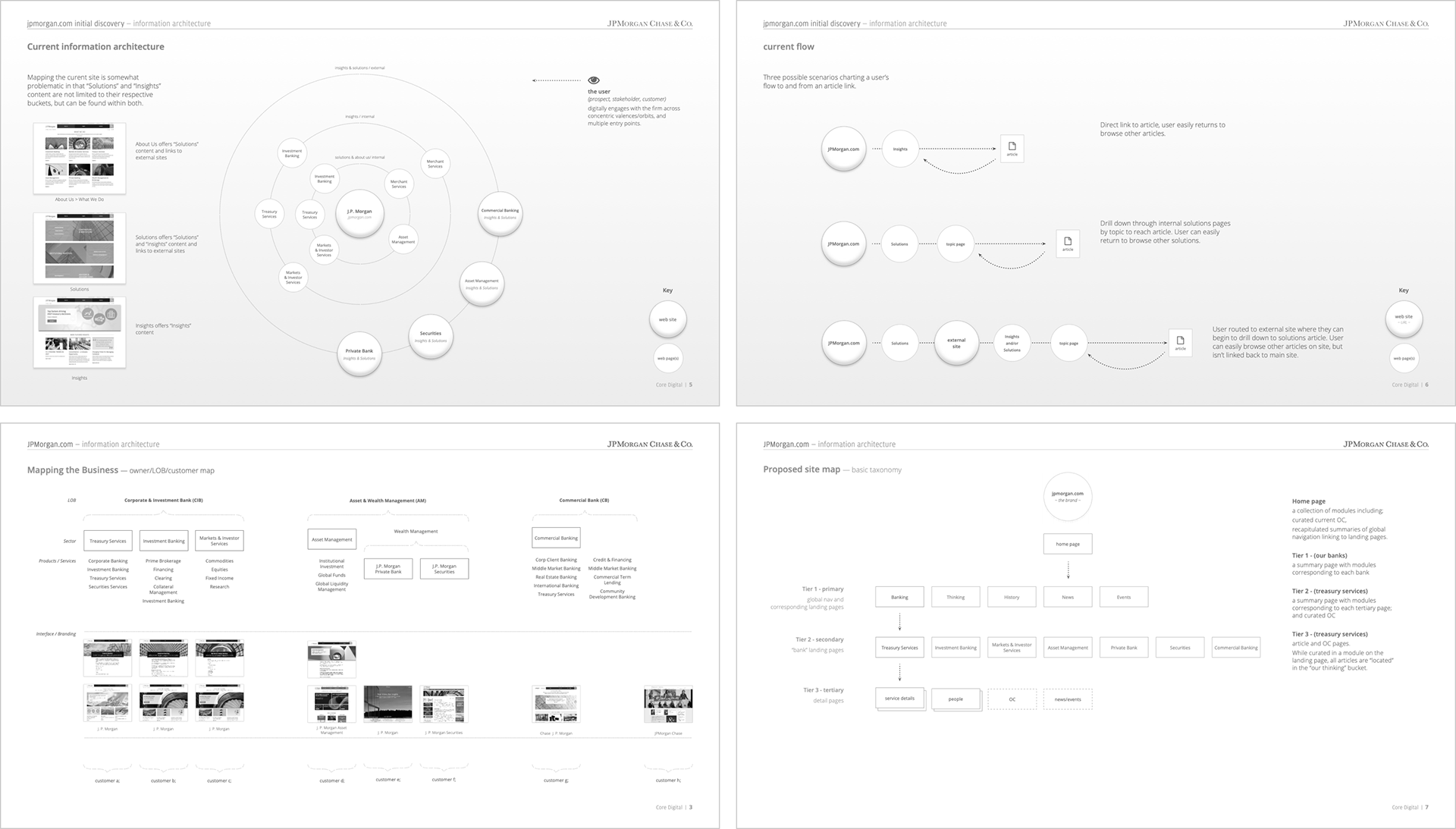
Information Architecture
We examined the relationship between two essential types of original content on J.P. Morgan's web properties: timely content and evergreen content. Our goal was to improve the following:
Information Architecture consistency and content-sharing potential
Product and service findability across lines of business (LOBs)
Brand perception and credibility

D I S C O V E R Y / U X R E S E A R C H
Personas & User Journeys
We created journey maps and use cases for our target personas to test and validate the effectiveness of the site's user strategies and structure at crucial decision points. This helped us to:
Identify prominent and easy-to-use features
Develop well-curated user flows for clients and advisors
Innovate SEO and content tags to improve search
D I S C O V E R Y / U X R E S E A R C H
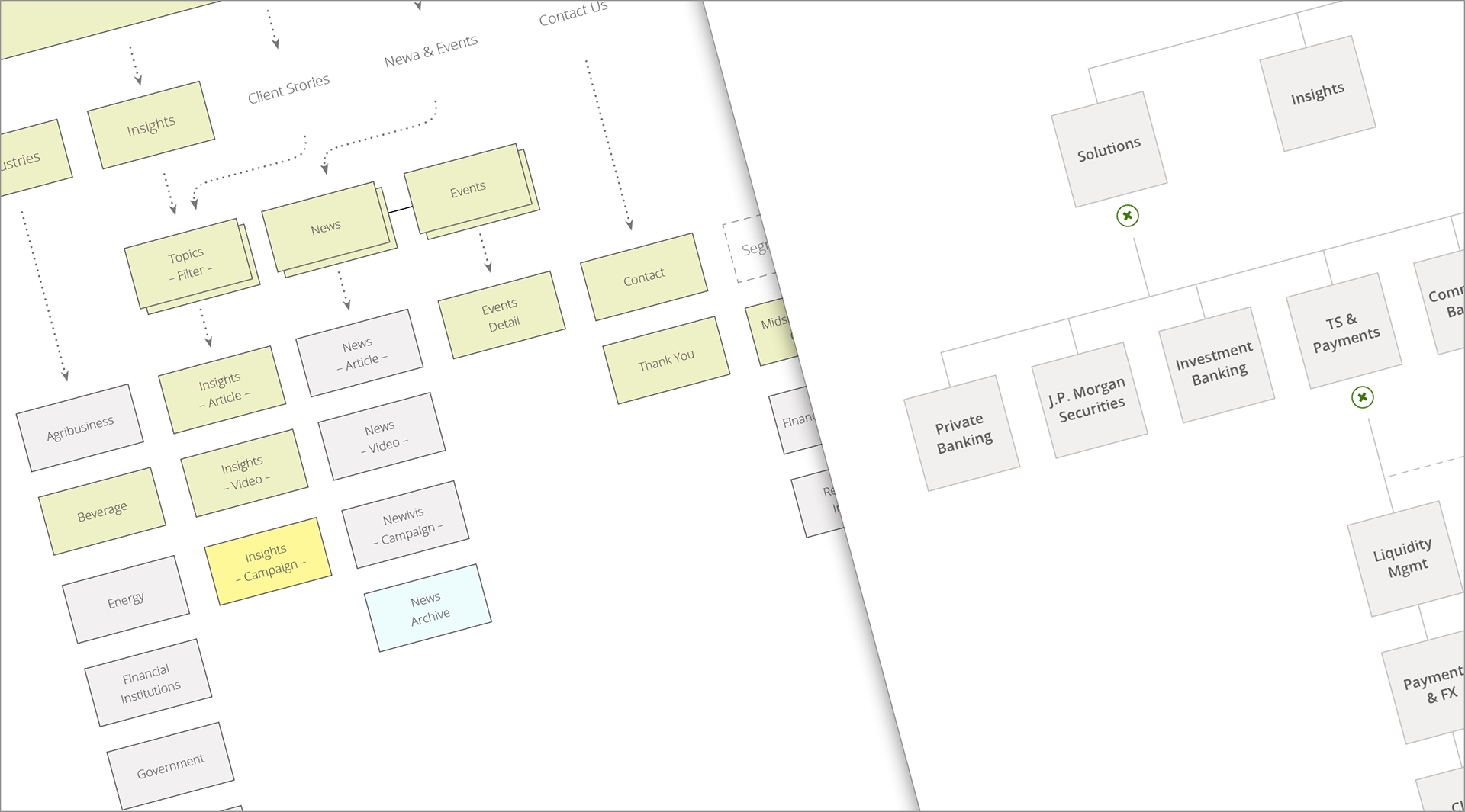
Sitemaps
We created sitemaps to plan the overall structure and organization of the website, ensuring that all pages are easily accessible. This helped us to:
Define the website's hierarchy
Illustrate how the website's pages are linked together

D I S C O V E R Y / U X R E S E A R C H
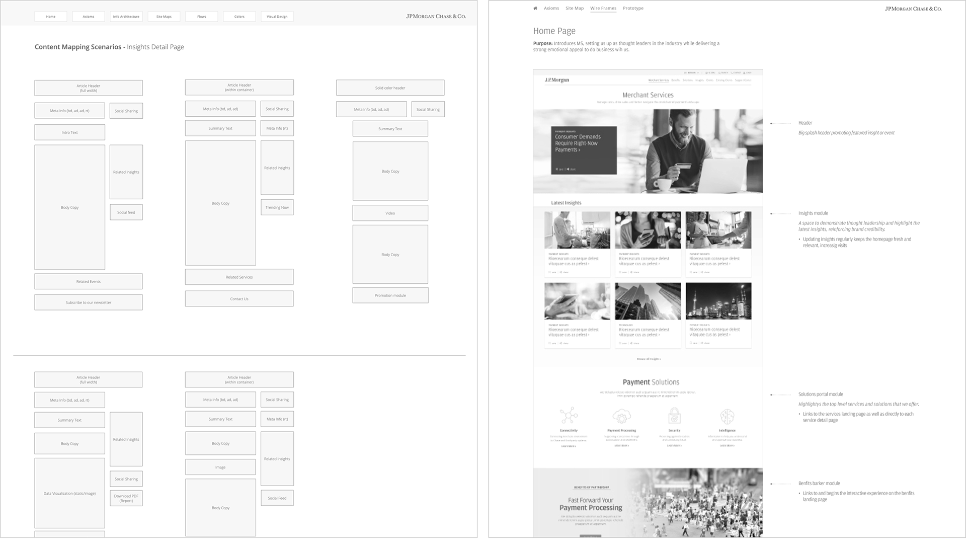
Wireframes
We used wireframes to improve empathy and drive cross-team discussions towards decisions about detailed requirements. This helped us to:
Define the purpose of the page
Describe its context
Map out content and components

D I S C O V E R Y / U X R E S E A R C H
Prototypes
We created low-fidelity prototypes that performed well in user testing, which helped us to:
Enhance the design's value by addressing pain points
Identify opportunities for improvement
D I S C O V E R Y / U X R E S E A R C H
Content Mapping
We used content mapping to plan and organize the structure and layout of our content:
Ensuring that all content is easily accessible
Logically arranged
Optimized for search engines (SEO)

D I S C O V E R Y / U X R E S E A R C H
Topic Tagging
We improved content findability by aligning a tagging strategy across departments with related content. This resulted in a significant SEO boost for the overall site. Additionally, reusing Insights content reduces redundant efforts, such as:
Promoting content sharability with lines of business cross-links
Publishing LOB-specific content on respective sites
Promoting One Firm values with cross-departmental links

D I S C O V E R Y / U X R E S E A R C H
Topic Filters
We improved search with topic filtering by using the robust content management features built into Adobe Experience Manager. This allowed us to:
Provide more search options with faceted filters
Automatically refine and refresh results as filters are applied

D I S C O V E R Y / U X R E S E A R C H
Usability Tests
We used InVision and Sketch to create clickable prototypes to improve our understanding of user flows, identify gaps, and define the following:
Validate information architecture
Test optional scenarios
Prioritize usability friction and pain points

D I S C O V E R Y / D E S I G N R E S E A R C H
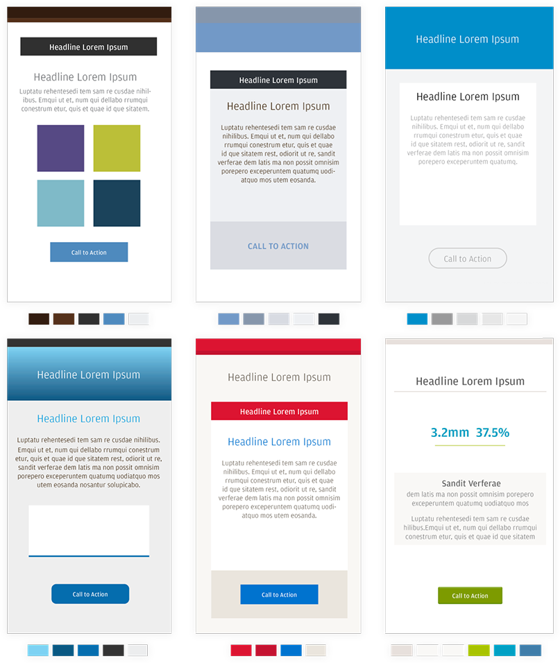
Color Comparisons
We focused our research on essential brand treatment choices, such as color palettes and visual brand cues used on competing financial services websites. We specifically examined the following:
Color scheme and harmony
Color hue, tint, tone, and shade
Color hierarchy and mapping
D I S C O V E R Y / D E S I G N R E S E A R C H
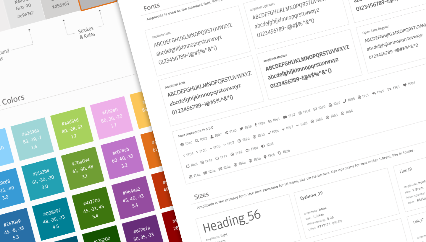
Style Guides
We started with an essential style guide that collected all of our design documentation in one place:
Color palettes and usage
Font styles and typography
Icons and infographics
UI kits and component catalogs
D I S C O V E R Y / D E S I G N R E S E A R C H
Motion Studies
We developed motion specs guided by three core principles:
Natural motions follow the laws of nature, resulting in smooth and intuitive animations and transitions.
Performant motions have little to no impact on the product's performance.
Concise motions are purposeful and meaningful, avoiding excessive animation.